-
Traffic
Get More Traffic
SponsoredLinX offers a number of different services to help drive more qualified traffic to your website. Google Ads Management Search Engine Optimisation Microsoft Ads Facebook Advertising Google Ads Mobile“SponsoredLinX are a rarity in today’s market place, they promise a lot but deliver more. Our business has grown by over 400% in one month; we are amazed at the difference they have made.”
-
Conversion
Convert More Leads
Our second step is making sure that your website is able to convert the traffic you receive into leads for your business. Optimising your website to convert more leads is important to a profitable campaign. Web Development Convertopages Do It For Me eCommerce“I just want to say thank you! The changes that you have applied in our AdWords campaign have definitely seen an improvement on click quality and sales for HippityHop.”
-
Retention
Retain Your Customers
As you build up a customer base you need to make sure to keep engaged and retain your relationship. Facebook Management LinX App“SponsoredLinX fully redesigned our main company website with a fresh, clean and professional look. The ‘Google friendly’ web design were part of the fantastic ongoing service we received.”
Optimise with Mobile SEO
For Australian SMEs, the digital market is undeniably growing. eMarketer recently reported that, “Next year, Canada and Australia will surpass South Korea to become the sixth- and seventh-largest mobile ad markets globally, respectively,” (eMarketer, 2015). With the abundance of data, statistics and reports which all point to a mobile internet future, it’s simply imperative that your business keep up with these trends.
Truthfully, we are heading to a point in time where having a mobile responsive website will no longer give you a competitive edge because it will be the norm. It means now more than ever that you need to put your agile SME owner hat on and embrace the mobile internet search era.
People have been surfing the Internet on mobile devices for at least five years now and this has increased the number of search queries on mobile devices. It should not come as a shock that Google would recognise the growing importance of these searches and work on improving their system to accommodate this.
Google released their mobile-friendly update on April 21, 2015 (USA) targeting search rankings on mobile devices and assessing queries on a page by page basis. According to Google’s Webmaster Central Blog, “The intent of the search query is still a very strong signal – so even if a page with high-quality content is not mobile-friendly, it could still rank high if it has great content for the query”. So while transforming your site to be mobile responsive is a key aspect here, maintaining genuinely relevant content on your site does not diminish!
Mobile sites, Apps and responsive web design are not a new development. In fact, the early stages of this concept of a more ‘fluid’ layout (now called responsive layout) can be seen on sites created as early as 2009. When going through Google’s suggestions for choosing between responsive layout, mobile website and mobile app they seem to imply that they favour responsive design due to its simplicity. This is not to say that Apps and mobile sites are ineffective, but they require a bit more consideration regarding their configuration on a server (i.e. whether to use dynamic serving or separate URLs).
Here is an example of a positive result for a mobile responsive website put through Google’s ‘Mobile-Friendly Test’ tool.
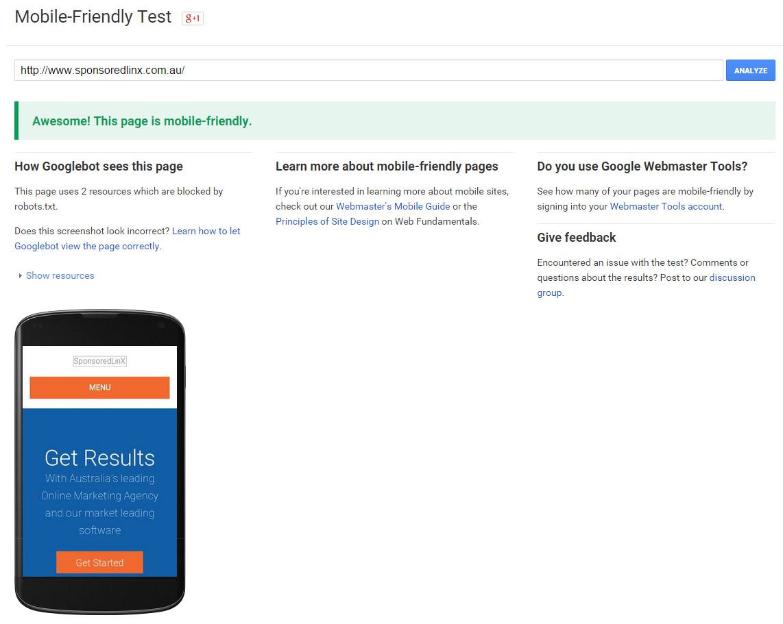
If you enter a URL for a site which is yet to be made mobile-friendly, Google will list the number of features which need to be fixed in order to make it mobile friendly. It is really all about the user experience. If someone clicks on your website URL, Google wants to ensure that the website experience the user is having is performing at its optimal level.
SponsoredLinX Founder & CEO, Ben Bradshaw, appeared on Sky News Business on the date of Google’s Mobile-Friendly Update release, to speak about everything you need to know as a business owner. As a result of the overwhelming interest in how we can help businesses, Ben will be sharing his knowledge in our upcoming ‘SEO Tips & Tricks’ Optimise Webinar on Wednesday 27th May.
People are using their mobile phones to search the internet more and more. In an article on Search Engine Watch, it states that, “Google search interest in “near me” has increased 34 times since 2011 and nearly doubled since last year. The vast majority come from mobile — 80 percent in Q4 2014,” (Jarboe, 2015). When people are out and about, they will commonly search for types of businesses, or products which they can find within a close proximity to them. So while they are also looking for information, the right information available to them at their fingertips also informs the decisions that they make. It means having an SEO mobile strategy in place to seize these moments.
Register for our ‘SEO Tips & Tricks’ Optimise Webinar, today to learn how having a mobile responsive website and your SEO strategy are imperative to your business’s online success.