-
Traffic
Get More Traffic
SponsoredLinX offers a number of different services to help drive more qualified traffic to your website. Google Ads Management Search Engine Optimisation Microsoft Ads Facebook Advertising Google Ads Mobile“SponsoredLinX are a rarity in today’s market place, they promise a lot but deliver more. Our business has grown by over 400% in one month; we are amazed at the difference they have made.”
-
Conversion
Convert More Leads
Our second step is making sure that your website is able to convert the traffic you receive into leads for your business. Optimising your website to convert more leads is important to a profitable campaign. Web Development Convertopages Do It For Me eCommerce“I just want to say thank you! The changes that you have applied in our AdWords campaign have definitely seen an improvement on click quality and sales for HippityHop.”
-
Retention
Retain Your Customers
As you build up a customer base you need to make sure to keep engaged and retain your relationship. Facebook Management LinX App“SponsoredLinX fully redesigned our main company website with a fresh, clean and professional look. The ‘Google friendly’ web design were part of the fantastic ongoing service we received.”
Constructing the Perfect Banner Ad
Create Ads People Want to Click!
For as we have been surfing the web as we know it today, we have been doing so under a barrage of banner ads for almost everything we could possibly think of. From their humble beginnings in the early 90s banner ads are now in almost everything we do online. Be that browsing a website on a PC, buying that new pair of shoes on your tablet or tweaking your selfie with a favourite phone app, you are bound to run into a banner ad or two. So with all of the competition how do you make sure your ad gets noticed?
Before we look at what makes a good banner ad let’s take a trip down memory lane and reflect on what history has taught us. Remember those ads violently flashing ‘You are the 10,000th Visitor, Click Here To Claim Your Prize!’. They sounded almost too good to be true! Well as we now know they were. In the late 90s and early 00s deceptive banner ads and exciting mini games prompting you to ‘Shoot the Phone and Win’ were all the rage but we soon learnt were quite deceptive. As a result our trust in banner ads waivered with 54% of us now thinking twice before clicking on them.
Making outlandish or unrealistic promises or trying to draw attention to your ads by way of seizure-inducing animations will lead to people distrusting and avoiding your ads. Animation certainly is a great way to get your ad noticed, just make sure you don’t overdo it.
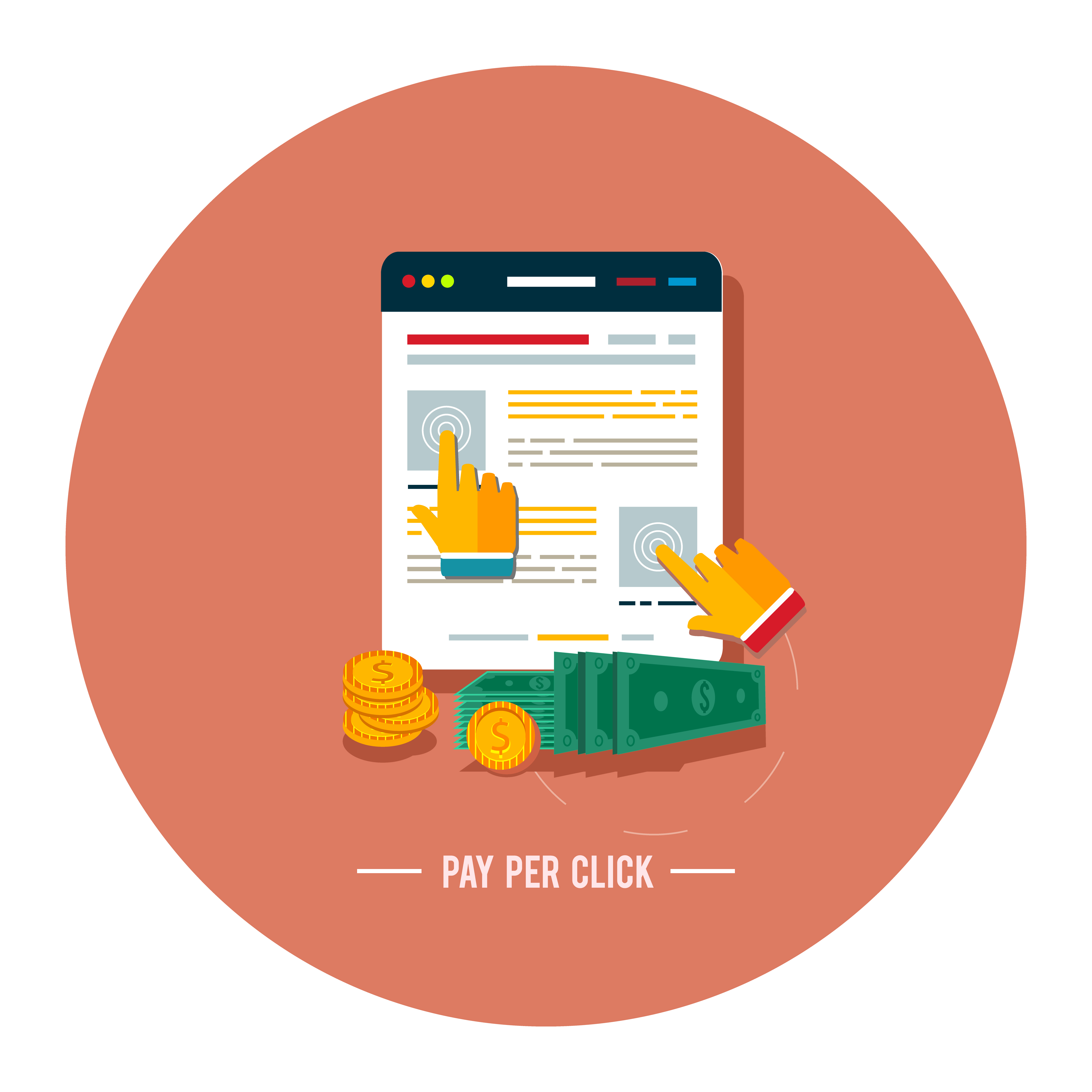
So what should a good banner ad look like? I get asked this question so frequently and while I don’t believe there is any magic formula there are a few things which any self-respecting banner ad should contain. Most banner advertising is more about branding than direct response so make sure to include a clear logo. I, like most people these days, love my online shopping, so when I am presented an ad for just the product I was looking for I get excited and click. Oh dear, what a shame! It’s the same site I already decided not to go with because I didn’t like their postage charges. The advertiser has just paid for a click and I have bounced straight off their site because their ad wasn’t branded properly. Branding doesn’t stop at the logo; it extends to the colour scheme, fonts, imagery and layout of the ad too. The more you can drive the connection between your banner and the experience someone has had or will have with your website, the better.
All the branding in the world won’t help you unless you have a compelling value proposition. My time is valuable and with all of the choices we have online you had better have a good reason for diverting my attention for a few precious seconds. I’m a firm believer most of us who are looking online for a product or service are driven by price, convenience or availability so while not always the case your value proposition should appeal to at least one of those needs and differentiate your business accordingly.
There is one other motivator that if used wisely can really boost your responses and it is so popular now it even has its own acronym. FOMO (Fear of Missing Out) can really help you to drive those fence sitters to click on your ads. Don’t just mention 20% off store wide; tell people it will end soon. A sense of urgency around your value proposition can make all the difference.
An ad should finish with a clear, concise call to action usually in the form of a button. ‘Shop Now’, ‘Book A Free Assessment’, ‘Enrol Online’. Your call to action needs to reflect what you want someone to do. No one is going to click on a button labelled ‘Enrol Now’ when they are looking for someone to unblock their drains. Make sure the call to action reflects the desired customer action.
So now you know the basics it’s time to get creative and start designing. Brand awareness and engagement are only a few small images away! Start creating banner ads people want to click on with SponsoredLinX today! Call us on 0800 004 672.